

Big update to PragmataPro just came out, including a new variable font version: https://fsd.it/2025/03/20/pragmatapro-0-9-released/
Fabrizio Schiavi Design · PragmataPro 0.9 released! - Fabrizio Schiavi DesignThe variable font version is now available. Improved math symbol weights for better coding, enhanced Nerd icons for readability and more…

 1/n
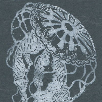
1/n it would cut away. It is printed by hand, from two carved relief lino blocks in lavender, silver, pale yellow and phthalo blue on delicate Japanese kozo (or mulberry) paper. Each print is 8\" by 9\" or 20.3 cm by 22.9 cm.")


 https://social.lokipropagand.art