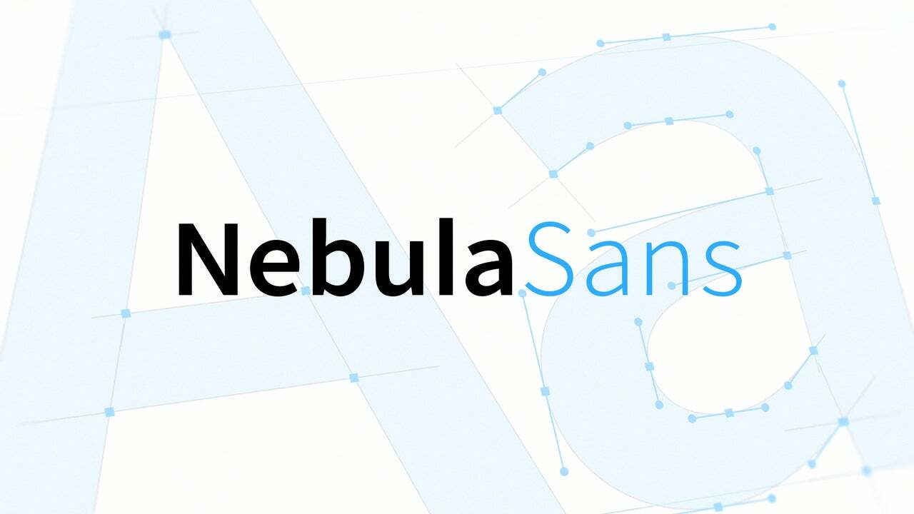
things i did not expect to learn through a mini-documentary about #Nebula's font design:
the person who added the gender modifier to emoji found out they're nonbinary through the process of making the proposal.
https://nebula.tv/videos/nebula-sans/
Frühere Suchanfragen
Suchoptionen
#font
@LinuxAndYarn @catsalad
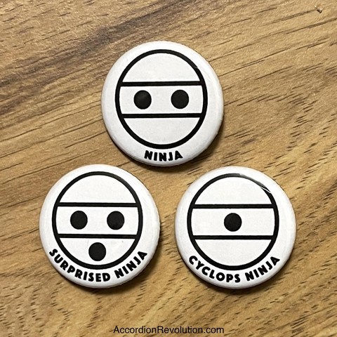
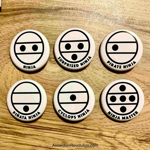
The Accordion Ninjas are a joke that appeared on the other site ten years ago that made me and maybe two other accordionists (and maybe an organist) laugh
Years later I started making button/badges which have never sold tons — they’re so deeply inside — but make me smile every time I see them
@luke helped make #Tango Ninja ones last year which dig the joke even deeper, but again
They use the fab Accordion #Font you can encode messages with!
https://accordionbruce.etsy.com/listing/1346366547
“Reimagining Fluid Typography” by @mia
https://www.oddbird.net/2025/02/12/fluid-type/
> Never do pixel math with `em` and `rem` units. That’s where we went wrong, by assuming that `16px == 1em` is a reliable fact.
It reminds me a lot of what I was pretty vocal about a few years ago, including “People don't change the default 16px font size in their browser (You wish!)” and “Users DO change font size”.
But I don't understand how this code…
️ https://nicolas-hoizey.com/links/2025/03/20/reimagining-fluid-typography/
@kianga uwu.
What license are the #fonts under @eurofurence ?
- I really need to add it to my #font list...
And where can I get the TTF files?
After reading the GNOME blog, I learned that Inter font family covers 147 languages, but Arabic, Chinese, Khmer, Japanese, Lao, and Thai are not included.

“Reimagining Fluid Typography” by @mia
https://www.oddbird.net/2025/02/12/fluid-type/
> Never do pixel math with `em` and `rem` units. That’s where we went wrong, by assuming that `16px == 1em` is a reliable fact.
It reminds me a lot of what I was pretty vocal about a few years ago, including “People don't change the default 16px font size in their browser (You wish!)” and “Users DO change font size”.
But I don't understand how this code…
️ https://nicolas-hoizey.com/links/2025/03/20/reimagining-fluid-typography/
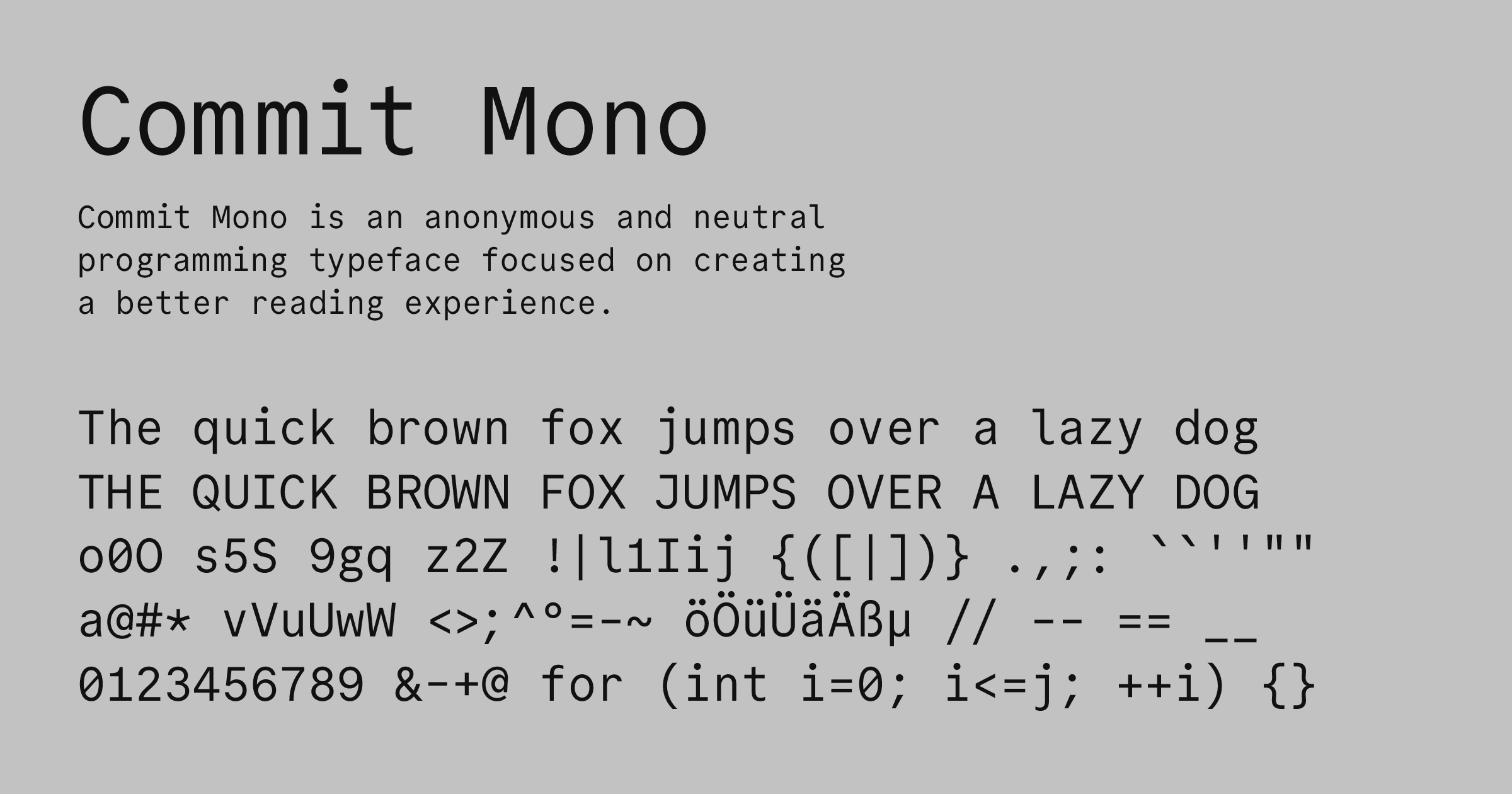
Okay so I really like the Commit Mono #font at
But that website is a usability *nightmare*: it has keyboard navigation using via JS to make it feel like you're using Lynx, which is all well and good...
But if you click too many times, it will block your clicks for a couple of seconds and flash a message "try using the keyboard!" because they really wanna show off.
Then I went to download the font and I'm met with "Safari download not working, try Chrome."
C'mon. Wow.

May I present just the absolute worst kerning ever. Spotted on a cheap 2-ton engine hoist/cherry picker.
Look, if I have to suffer, everyone else should also have to suffer.
Le lancement de la fonte Velvelyne, ce sera demain à la librairie Météores à Bruxelles à 19h ! Venez nombreux.ses ! #bruxelles #font #fontRelease #Velvetyne #typography #event #belgium #belgique
OK, I got fed up of confusing Al with AI. Any Sans Serif #font recommended that has clear distintion of confusable glyphs (1/l/I, 0/O, etc).
Designing Safety-critical #interface s entails proving the #safety and operational #usability of each component.
See this experimentation-based
#typographical #design #study for safety-critical contexts.
https://enac.hal.science/hal-01022511/file/Legible_are_you_sure-.pdf
It lead #Airbus to engage a group of designers to create a special #truetype #font, called B612. You can use #B612 for free:
https://b612-font.com/
Woah! Thank you!
Never thought I would be saying this... I'm one bundle sale away from the max sales goal on itch!
It is an honor to updating and expanding out my font collection!
More Info Below
Eine leckere Sonntagsschrift: https://bsky.app/profile/ilovetypography.bsky.social/post/3ljwbjv7na22e via @ilovetypography
#Font #typography #Schriftart #FediFont #Fonts #FontDesign

Truly enjoyed this week's #Tedium @tedium by @ernie
I actually have Bell Centennial still installed from the days when Penny and I owned our newspapers. We used the fonts in our display advertising and "enhanced" classified ads.
I load the old font archive onto every new computer I get. #font #Fonts
There is something beautiful and magical about fonts. A true work of art. A world where art and text collide.
Tiny Type On Yellow Pages
Why AT&T had to redesign its primary phone-book font in the late 1970s to keep with the times, and the clever typographical trick it used.
https://tedium.co/2025/03/05/phone-book-typography-bell-centennial-ink-trap/
Hey #font & #typography nerds...what's this one? I find it pleasing but it also feels expired.
Unfortunately, too many of these old schools are also at risk of being lost (including this particular one), and if they, we lose not only the building itself, but also all the other aspects of their design, including the fonts used on their facades.
I love the font used for this date plaque from the former Greenfield Primary School in Govan. Glasgow's traditional sandstone schools have a wonderful variety of different fonts, and several different ones can often be found on the same building.
Cont./

